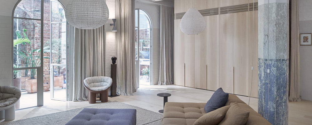
At the very heart of Melbourne’s CBD are a small number of laneways known for their lively restaurants, bars and cafes and standing majestically at the centre of all this activity is an early 20th century concrete building by pioneering engineers David Mitchell and Sir John Monash. An early exploration into formed concrete, the building in Oliver Lane was originally Mitchell and Monash’s headquarters, but was later used by various rag traders who, over the years, altered the interior beyond recognition.
Working as a young designer for Joseph Saba, Uschi Schwartz came to admire the raw beauty of the building but never considered actually living there, until serendipity led her, and husband Danny, to rent an apartment in the building while their house in Windsor was being renovated. The couple quickly realised that living in the heart of the CBD was what they wanted – they just needed a way to overcome the constant noise, smells and light pollution that went with dense urban living.
‘We knew the potential of the building and approached O’Connor and Houle, who we had worked with several times before, to help us rejuvenate the space and make it more liveable,’ says Uschi. 'We combined two apartments and demolished all the false walls and ceilings, leaving just the concrete shell. We stripped the columns back to the original paintwork and could see that each had a different character, with different paint colours. They became poignant art works dotted through the space,' she says.
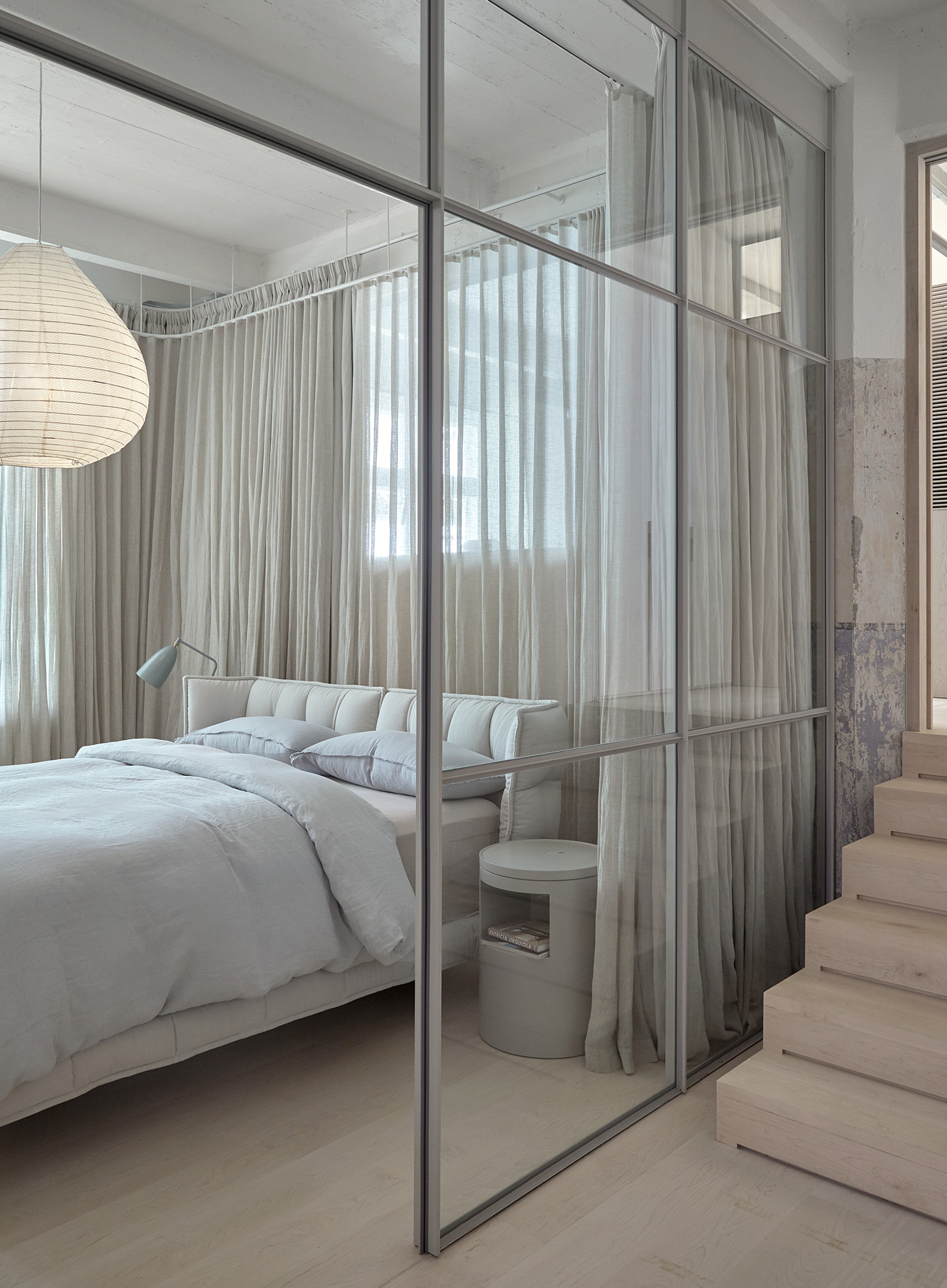
The bedroom features the upholstered Tufty-Bed designed by Patricia Urquiola for B&B Itaia. Photo © James Geer.
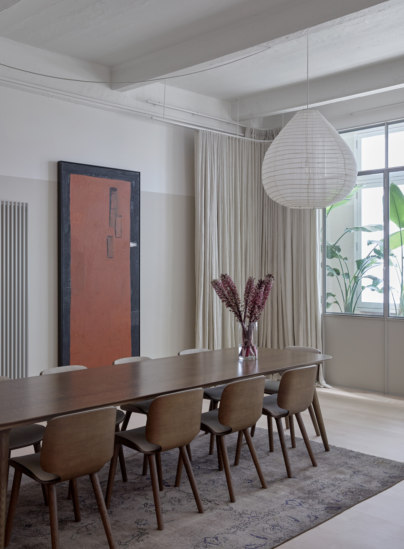
In the dining room the upholstered timber Nut chairs and the solid timber Zio table designed by Marcel Wanders for Moooi. Photo © James Geer.
'Beautifully designed furniture should be functional but also like a piece of art. We try not to follow trends and we tend to choose furniture that won’t date. Good design will remain good design for decades to come.'
Uschi and Danny Schwartz
With the absence of standard dividing walls, joinery and furniture became key to defining the various spaces. Canadian Rock Maple was used on floors and walls for its pale colour and to add warmth and balance the concrete. Fine, steel-framed highlight windows were installed above a datum line that continues through the entire apartment. Multiple layers of glass within the steel-framed doors and windows provided essential acoustic insulation from the noise of the laneways while allowing light to penetrate into the centre of the apartment.
‘The clients loved the inner-city context but wanted their home to be the antithesis of the pace, noise and clamour of the city. The conceptual aim was to expose and preserve the concrete structure, which is listed on the Victorian Heritage Register, whilst satisfying the diverse requirements of a family home,’ says Stephen O’Connor director of O’Connor and Houle Architects.
Curtains wrap around each bedroom, solving the problem of light spill from surrounding businesses while an air filtration system specified by the architect pumps in purified air 24/7. Uschi and Danny were keen to have some sort of green space, and this was ingeniously delivered by way of a garden atrium that forms a green moat around the internal space. Original brick work was exposed in the garden space to give a radically different and much more rustic feel, as an appealing counterpoint to the smooth, pale interior.
‘The space feels more like a house than an apartment in the city,’ says Uschi. ‘We have direct access onto the lanes and when one walks into the apartment you are suddenly in a very private and serene space.’
Here, More Space chats with Uschi and Danny Schwartz, owners of the Oliver Lane Apartment, Melbourne by O'Connor and Houle Architecture.
More Space: What do you like most about the apartment?
Uschi and Danny Schwartz: We love the volume, the large open spaces, the tall ceilings, the raw concrete shell, the stripped back columns, the fine detailing of the timber walls and floors and the steel/glazed wall frames.
What time of day do you enjoy most in the space and why?
We love the early evening when we can sense the city ambience of the laneways but feel protected in our very quiet space.
Which ‘room’ do you enjoy being in the most?
We love the whole apartment and enjoy how the space flows and stitches multiple living and work-related spaces together. Danny’s favourite feature are the highlight windows. From our bed we see through the entire living space, past a number of stripped back columns, to the lit-up courtyard.
The use of texture and maximising of light seem to be key components in your interior. How did the furniture selection work into this?
Our open-plan house has steel-framed glazed walls with dense and sheer linen curtains throughout, together with linen light fittings to create softness and warmth. The furniture we chose had to sit comfortably in large open spaces yet not detract from the softness we were seeking.
'We particularly love B&B Italia who manufacture timeless pieces, including the Tufty-Time sofa that we have owned for 20 years... They function beautifully in large areas and are great for family, friends and kids to stretch out on.'
Uschi and Danny Schwatz
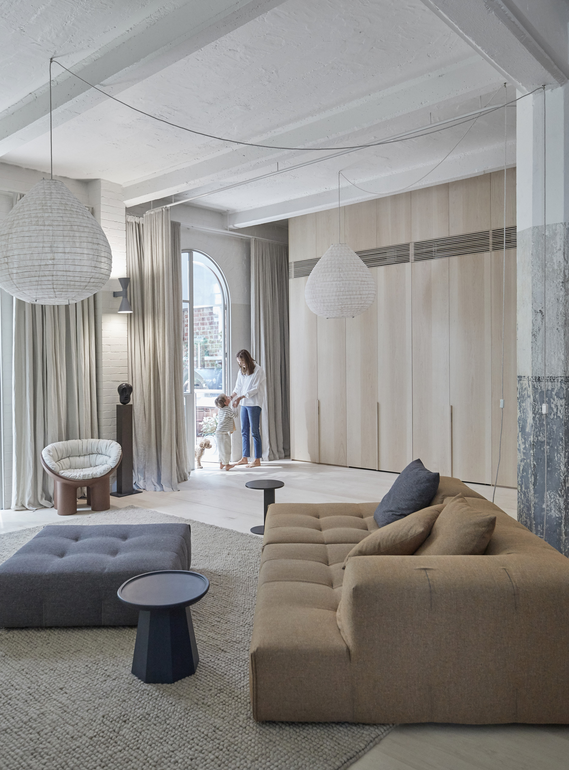
The living room features the super flexible Tufty-Too sofa designed by Patricia Urquiola for B&B Italia. Photo © James Geer.
Did working with an architect change the way you selected your furniture and lighting?
We worked very closely with our architect, Stephen O’Connor, so it all fell into place. We have worked with Stephen on a number of projects, and he has a real understanding of how we like to live.
Of the pieces you have sourced from Space which reveals your personality most and why?
We particularly love B&B Italia who manufacture timeless pieces, including the Tufty-Time sofa that we have owned for 20 years. In-fact we love it so much we have one in the city and one at our beach house. They function beautifully in large areas and are great for family, friends and kids to stretch out on. It’s great that you can replace the covers at get an instant refresh. We also love the B&B Italia Husk series designed by Patricia Urquiola. They are beautiful stand-alone pieces that feel incredibly luxurious.
How does design enrich your day-to-day life?
Beautifully designed furniture should be functional but also like a piece of art. We try not to follow trends and we tend to choose furniture that won’t date. Good design will remain good design for decades to come.
What design item from Space do you currently have your eye on?
The B&B Italia Ayana outdoor stone table.
Who was the biggest design fanatic during the process, you or Danny?
I spent a lot of time dreaming up the interior concept and then we worked collaboratively to bring it all together.
Thank you, lovely to talk with you both.
